Universal Access for Portland Metro Riders
With over 98 million trips a year and 533 square miles of service area, Portland’s Trimet Metro agency provides some of the the best public transportation in the country. Its ridership spans every age group and its busses and trains have excellent accessibility for disabled riders. However, its ticketing and trip planning app did not reflect its commitment to accessibility. Many of its riders are elderly, disabled, have low-vision, or experience various levels of cognitive diminishment. As a passion project, I set out to redesign an MVP that would meet their needs in addition to those who are able-bodied.

A Clear Lack of Empathy
My heuristic analysis revealed limitations in the app's flexibility, efficiency of use, and lack of aesthetic design especially as it related to low-vision riders (see current design below). The entire ticketing function had a myriad of icons that were too small, hard to see, and excessive. Type was too small and hard to tap especially for older riders. And the ticket selection screen used an accordion pattern that was confusing to navigate for some and did not make good use of space. Finally, the app only allowed one ticket to be displayed after being activated. This proved cumbersome as the user had to navigate back to an activated tickets screen and then tap on each activated ticket to show a bus driver.
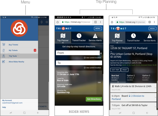
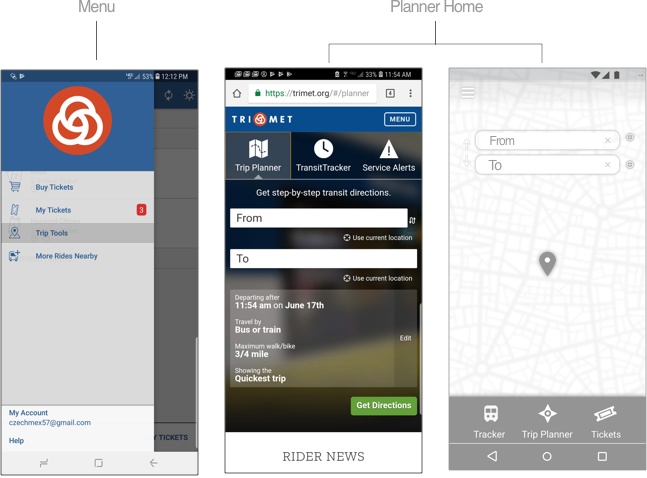
Trip planning was not directly integrated into the app but was obscurely linked in the app's menu to Trimet’s mobile website. In addition, the look and feel of the app and website were very different and resulted in a disjointed and confusing UX. Again, much of the type in the UI was hard to see for low-vision and older riders were overwhelmed with the amount of information displayed.
My heuristic analysis was also integrated into my competitive analysis which revealed mostly similar experiences. Ten heuristics were evaluated and then tabulated into a final score.
Understanding The Lived Experience
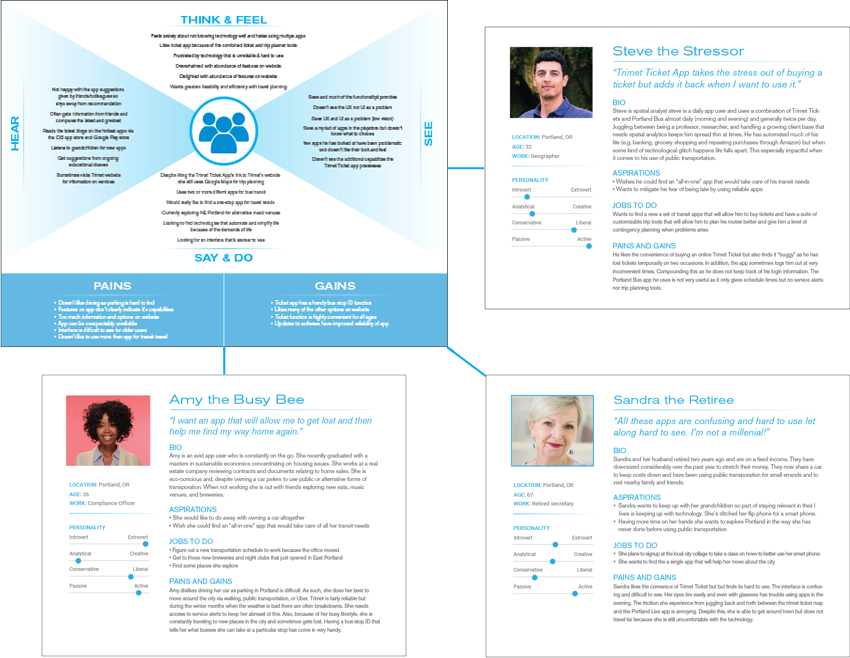
Being a Trimet rider myself, I already had valuable insights into its users. For years I had listened to their stories and knew from experience there was no "typical" Trimet rider. They came from all walks of life, incomes, professions, races etc. Looking to delve even deeper, I recruited ten riders with ages ranging from 23-75 to do open-ended interviews. Two main themes were identified. The first was that riders wanted an app possessing seamless functionality. All of them were tired of relying on one and even two additional apps to purchase tickets and navigate their trips. The second theme appeared with the the low-vision and 60+ rider who had a difficult time navigating between apps. They wanted a UI they could comfortably see. In addition, they found much of the functionality on the mobile website superfluous and wanted an app that had only essential features. Three distinct personas were identified from the data and developed.
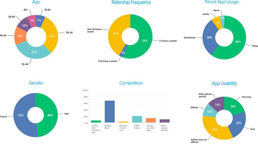
While conducting interviews I did an online survey of over 30 Trimet Ticketing App users and combined Trimet demographic data. It also confirmed many of the problems uncovered in the heuristic analysis and interviews. Over half of the riders did not find the app easy to use with those over 60 having the most difficulty. Below is a breakdown of the findings that covered demographics, ridership frequency, and app usage and usability.

Streamlining and Integration
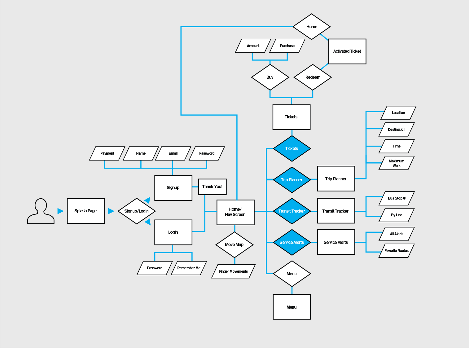
With research completed, it became clear to me that the Trimet Ticketing App and key functionality of the Trimet website needed to be housed in one elegant solution. Below is the user flow that paired down and integrated only necessary features. (See below user flow. Integrated features are in blue)
I drew copious sketches and the most promising were turned into paper prototypes. These prototypes were tested for user feedback and gave early validation to the redesigned ticketing and trip planning features. However, it became clear that alerts were not a priority function and were moved to the menu which allowed for more space to enlarge the icons and text in the main navigation. This resulted in easier tapping which the 60+ riders appreciated .

Narrowing Down The MVP
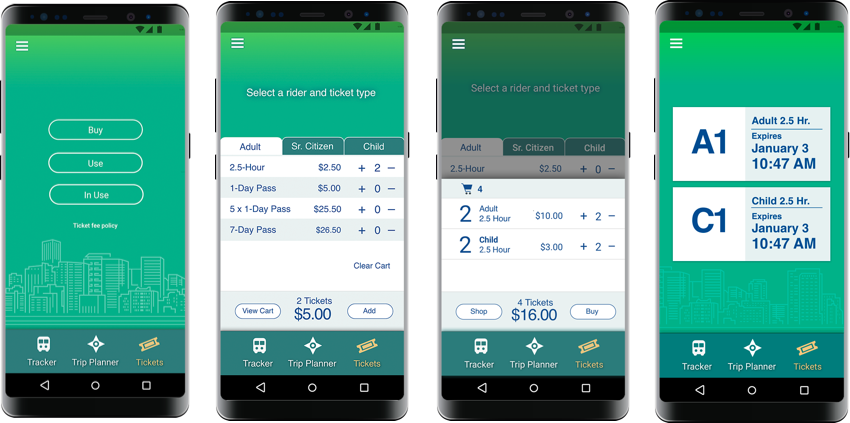
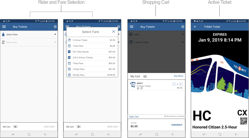
Streamlined Ticketing: For the ticket home I centralized main functionality onto one screen. And for ticket selection, I changed the current app's accordion pattern and replaced it with enlarged and easy to tap tabs (see the below comparisons)
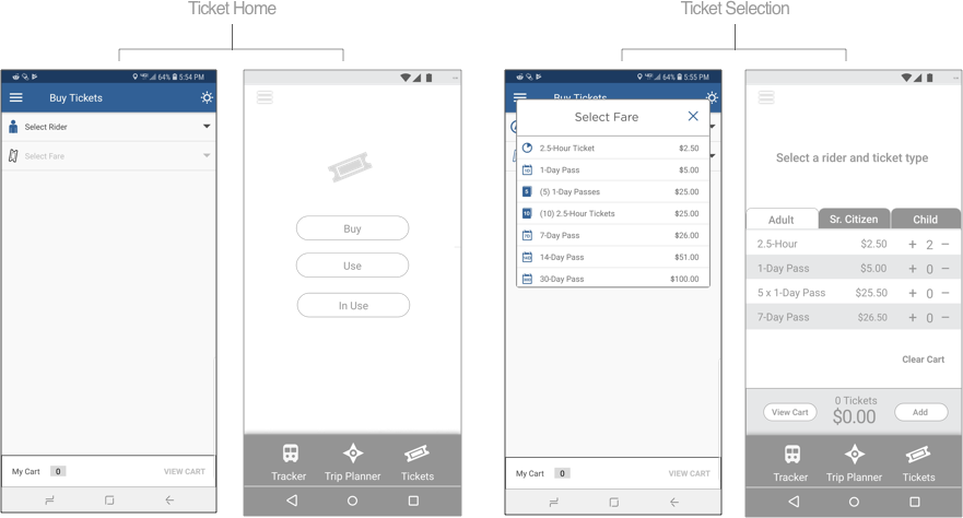
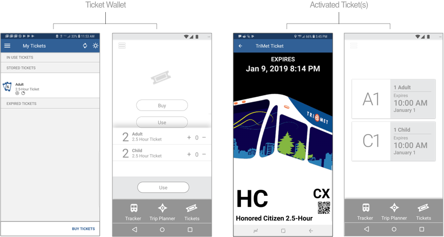
In addition, I removed the expired tickets function to make room for larger type and and larger hit areas for the ticket wallet. Finally, all activated tickets could be seen from one screen to quicken the onboarding of passengers (see the below comparisons).
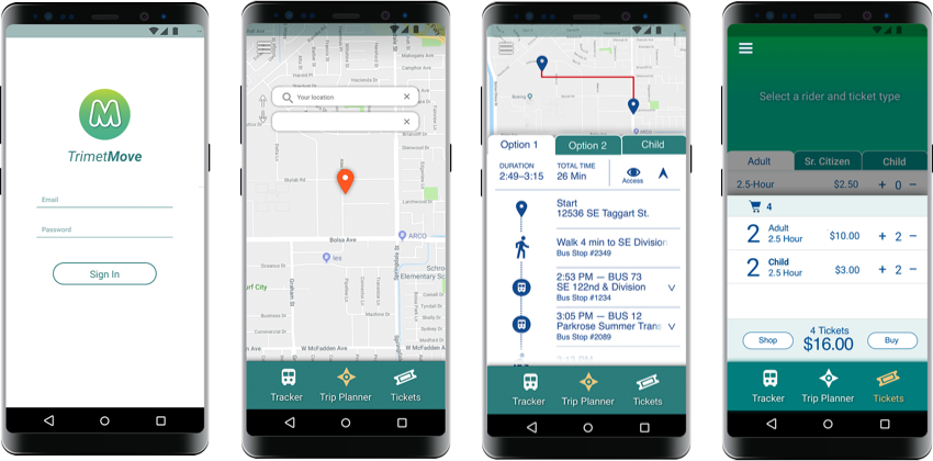
Integrated Trip Planning: I removed the trip planning function from the menu and made it easily accessible from the apps main navigation. In addition, I simplified the home screen and took out lingering previous trip information. A simple map replaced it to orient riders in space with two fields that specified current location and destination (see the below comparisons).
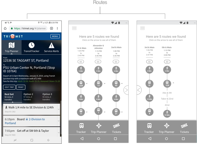
For route searches, I experimented with a simplified graphic interface and expanded the number of route options from three to five (see below comparisons).
Branding for Accessibility
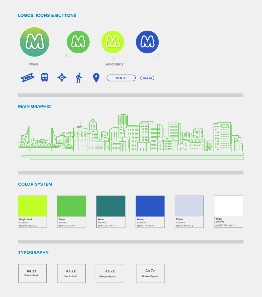
Having fleshed out the UX and turned my attention to the branding and naming. Trimet Ticketing App, was descriptive and dry so I renamed it to Trimet Move which was evocative and energetic. For the branding I designed a new icon and identity standards. Because Portland is in the heart of the lush Pacific Northwest, green and blue were chosen for the app's primary colors. Solid and bold navigation icons were also designed for better accessibility.

Pivoting Back to Basics
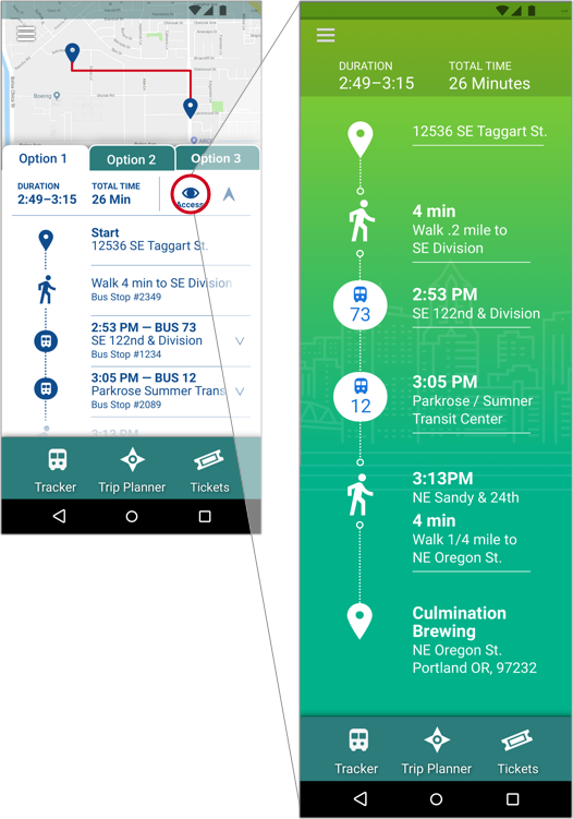
My testing for the graphic route interface with the applied branding was mixed. Younger riders rated it high but older and low-vision riders rated it low. Older riders found it especially confusing as they had to learn an unfamiliar pattern which took longer. Low-Vision riders still found the text hard to read. In addition, all test subjects had problems navigating to routes four and five (see right screen iteration 1). As such, I redesigned it and used the same tab pattern as the tickets which further simplified usability. Larger size and greater contrast for text and icons were also introduced further assisting low-vision users. In addition, the number of route options was limited to three further streamlining functionality (see iteration 2).

Route Monitoring for Low-vision Users
To bolster visibility I added a magnify function for riders with moderate to low-vision and mild cognitive diminishment. This enabled them to track the progress of their trip with greater ease. Initially, a magnifying lens icon was used to activate the screen but users thought it was a search function. An eye icon with the word “access” tested best and was incorporated.
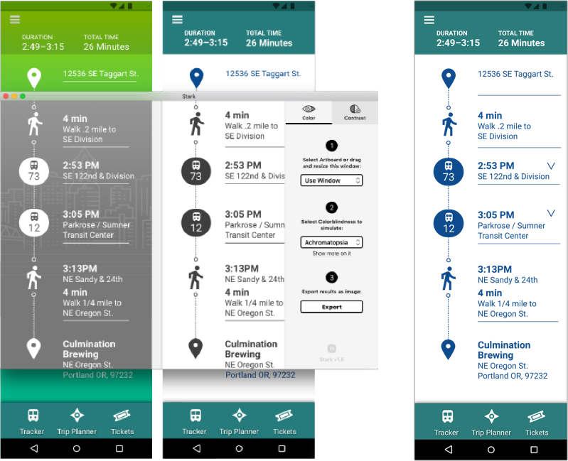
Help for The Color Blind
Additional refinements were made using the Stark plugin for Sketch. I was able to simulate various forms of color blindness and check WCAG contrast levels. The green background was also changed to white with dark blue text and icons to add further contrast. These changes surpassed WCAG’s AAA rating for both small and large text (final version on right).

The final prototype was tested on ten different metro riders from ages 22-73 and received a 100% completion rate. Low-vision riders especially liked the magnify feature and one was able to see route info without visual aids.